GLOBAL ECONOMICS AND POLITICS
Leo Haviland provides clients with original, provocative, cutting-edge fundamental supply/demand and technical research on major financial marketplaces and trends. He also offers independent consulting and risk management advice.
Haviland’s expertise is macro. He focuses on the intertwining of equity, debt, currency, and commodity arenas, including the political players, regulatory approaches, social factors, and rhetoric that affect them. In a changing and dynamic global economy, Haviland’s mission remains constant – to give timely, value-added marketplace insights and foresights.
Leo Haviland has three decades of experience in the Wall Street trading environment. He has worked for Goldman Sachs, Sempra Energy Trading, and other institutions. In his research and sales career in stock, interest rate, foreign exchange, and commodity battlefields, he has dealt with numerous and diverse financial institutions and individuals. Haviland is a graduate of the University of Chicago (Phi Beta Kappa) and the Cornell Law School.
Subscribe to Leo Haviland’s BLOG to receive updates and new marketplace essays.

Many observers point to booming corporate profits as a key reason for the splendid rally in United States stocks since March 2009’s dreary depth. The Federal Reserve’s generous highly accommodative monetary policy since late 2008, highlighted by sustained rock-bottom interest rates (yield repression) and several rounds of spectacular money printing, nevertheless coincides with this climb in corporate profits and the marvelous S+P 500 advance.
Many marketplace clairvoyants, including quite a few regulators, worry little about borrowing levels (and leverage) in the context of the wonderful ascent in American stocks. However, they should.
Soothsayers should examine New York Stock Exchange (NYSE Euronext) margin debt levels alongside the timing of Federal Reserve policy innovation and very important trend change points in the S+P 500. In recent years, pinnacles of NYSE margin debt have occurred close in time to those in US stocks; valleys in that debt roughly have coincided with S+P 500 troughs. Glancing back to the 2000 stock top and the depths of 2002/2003 shows a similar pattern. For the recent bull trend in American since first quarter 2009, underscore the Fed’s policy actions (and a couple
of European Central Bank ones) alongside these turning points in margin debt and American stocks. The most recent statistics (for January 2013) and the probable current margin debt levels are very elevated from the historical perspective. They consequently should concern marketplace watchers, even if many sentinels retain faith that there remains scope for even more margin debt and that lax Fed policies and booming corporate profits will persist.
Anyway, survey NYSE margin debt, Fed actions, and S+P 500 trends together. As in the joyous rally to the highs in US equities in 2007-08, judging from the NYSE margin debt statistics, a fair amount of leverage probably has encouraged the bull move in US equities since the March 2009 lows. That includes the recent S+P 500 spike since June 2012. The friendly Fed and its devoted allies probably deserve a hefty share, though not all, of the credit for these margin borrowing leaps since the equity abyss of first quarter 2009. And especially if US Treasury yields are low, why not search enthusiastically for yield (return) in US stocks?
FOLLOW THE LINK BELOW to download this market essay as a PDF file.
Margin Debt, Fed Policy, and Recent American Stock Price Trends (3-18-13)
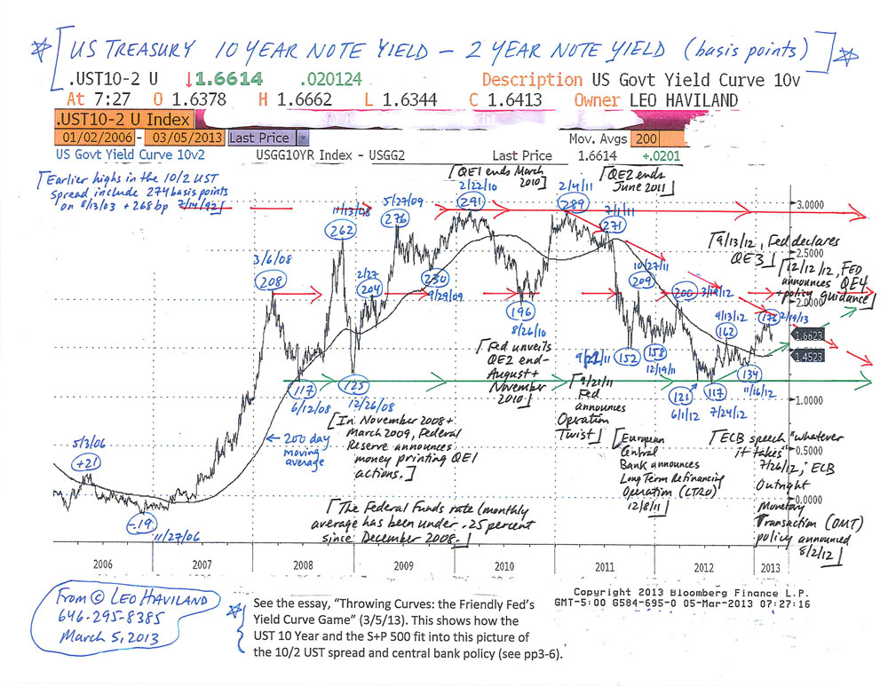
In professional sports such as baseball and Wall Street’s competitive marketplaces, history is not destiny. However, “the past” and variables apparently relevant to it need not be discarded as being of little or no importance, relevance, or guidance for current and future playgrounds. During the worldwide economic crisis that dawned in mid-2007 and the ensuing recovery, noteworthy moves in the 10 year less two year United States government yield spread often have roughly coincided with significant Federal Reserve Board policy decisions (and several months ago with major European Central Bank ones). These US Treasury yield curve ventures (trend changes) generally have occurred around the same time as significant moves in the US Treasury 10 year note and the US stock marketplace (S+P 500). Many lows in the 10/2 UST yield curve spread have tied up with (occurred within a few months of) important S+P 500 bottoms; pinnacles in the spread likewise link up somewhat closely in time with plateaus in the US stock playground.
The UST 10 year less two year spread probably established a major bottom on 7/24/12 at 117 basis points (10 year yield higher than two year return, so a positive yield curve; short rates over long rates creates a negative yield curve).
What would a further notable widening of the spread (steepening of the curve, more positive slope) from current heights around 165 basis points suggest to avid financial marketplace fans? Perhaps a sustained move in this 10/2 UST spread over around 200 to 210 basis points will indicate a renewed (further) strengthening of the US (and worldwide) economic recovery.
However, that upward path over 200/210 basis points instead may warn of impending economic weakness. This viewpoint is not necessarily as off base as some may claim. One needs to focus on whether America is a key source of and significant spark for likely global (not just US) feebleness.
In that regard, recall the shift from 6/12/08’s 117 basis point low (same as 7/24/12’s) up to 11/13/ 08’s 262bp as the financial crisis raced forward (Lehman Brothers bankruptcy 9/15/08). The US housing and financial leverage (banking system) problems were critical issues (though of course not confined to the US), even though the US (and the world in general) did not in mid-2008 yet face major fiscal troubles.
Why might the 10/2 UST spread widen (as in mid-June to mid-November 2008) nowadays or in the near or medium term? In some circumstances, there can be a dismal widening of the UST spread (and higher long term rates) accompanied by little or no economic growth (or even a recession). Suppose the current US (and international) economic horizon darkened significantly. Assume a big fiscal difficulty in the US is a major factor in this bleak outlook. Then maybe this time around, when economic downturn risks in general still loom large, there will not be as nearly as substantial a flight to quality into UST as there was at end 2008 (after mid-November) and as there has been at subsequent economic (downturn) crisis periods since then up to the present time. Thus this setup probably would produce an outcome for the 10/2 yield spread very unlike its pattern during the previous substantial financial deteriorations of the mid-November 2008 to the present time span. Many players (especially international ones) may not view the UST as wonderful quality (especially when nominal yields are so mediocre) if the US may or does become the star of a fearsome fiscal problem and related systemic economic crisis.
Yet the history of the past several years also warns that a slump in the 10/2 UST spread back close to around the July 2012 bottom probably signals US (and global) economic weakness as well.
FOLLOW THE LINK BELOW to download this market essay as a PDF file.
Throwing Curves- the Friendly Fed’s Yield Curve Game (3-5-13)
US Treasury 10 Year versus 2 Year Note Chart (3-5-13)
Federal Reserve Board generals have underlined that they indeed possess an exit strategy for their ongoing extraordinary easing program. Such confident rhetoric regarding an escape plan indeed helps to boost the morale of many economic and political observers of marketplace battlefields. Didn’t its entrance strategy work? The Fed Funds rate has stayed near the ground floor since late 2008, United States Treasury yields have collapsed relative to their 2007 heights, and US equities (use the S+P 500 as a signpost) have soared from their March 2009 abyss.
Yet marketplace combatants should be wary of the Fed’s exit strategy design as well as its tactical implementation. It is not a detailed and finished blueprint. In actual practice, the exit strategy involves significant risk, and it probably will not be put into practice nearly as timely or smoothly as propaganda from the Fed leadership hints. How rapid, coherent, and helpful were the Fed’s policy viewpoints and actions in the early stages of the worldwide economic crisis? As the Fed’s marketplace entrance strategy and maneuvers were very remarkable and evolved over time, why should its exit plan and its application be any more “orderly”?
Yet why should the Fed’s exit strategy be without some significant pain to UST and stock owners? There’s at least a significant risk of notable wounds. After all, the rally in debt and equity prices assisted by the Fed’s massive marketplace easing generally enriched and thus pleased owners of American stocks and UST (and many other debt instruments). Besides, we know the noble Fed is not the only significant policy maker and fighter on the US (and international) economic battlefield. Thus its practical control over marketplace outcomes has significant limits.
To what extent is the Fed Chairman accurate? Is the Fed Chairman trying to minimize the role of the Fed in financing (money printing for) the deficit and to understate potential overall exit strategy issues?
FOLLOW THE LINK BELOW to download this market essay as a PDF file.
Federal Reserve Exit Strategies (2-21-13)
Some United States stock sector energy-related indices such as the XOI, OSX, XNG, and RPE stand at a crossroads between the commodities related to them and broader equity benchmarks like the S+P 500.
Such relatively narrow energy-related equity estates intersect with the overall United States (and global) economy, not just energy provinces. The energy-related indices also entwine with their “underlying” commodities such as petroleum and natural gas. An equity index vehicle containing corporations involved in the petroleum industry reflects to some extent price levels and bull and bear trends in “underlying” (related) oil prices. These (and other) narrow United States stock sector indices therefore sometimes provide helpful viewpoints for (confirm, reflect) past, current, and future paths for broader stock indices such as the S+P 500 and Dow Jones Industrial Average, as well as for commodities “in general”. Many embrace the broad Goldman Sachs Commodity Index as a worthy indicator for the overall commodity world.
What do these four energy-related equity sectors flag nowadays to S+P 500 and commodity marketplace fans? Given their association (connection) to the broad GSCI (and that their directional walks have been roughly similar to those of the GSCI), and given the GSCI’s failure (so far) to match or venture over its spring 2011 peak, players should monitor closely whether the energy-related stock indices can sustain advances over their spring 2011 heights. Failure to do so would warn of weakness in the broad GSCI. Especially given the proximity of the major resistance levels in the S+P 500 (and that in the DJIA), the inability of these energy-related stock indices to sustain levels well above their springtime 2011 tops would confirm (or at least warn of) a downtrend in the S+P 500 as well.
FOLLOW THE LINK BELOW to download this market essay as a PDF file.
Commodity Crossroads- Energy-Related Equity Indices (2-15-13)


 View Leo Haviland’s profile